

So you're an amateur photographer who takes great shots every once in awhile. But, like most pictures, even the greatest of "shots" need a little enhancing to print out well, or simply to reflect what it captured more realistically. The question is: how do you edit your photos well without frying your brain in the technical world of photo shop or gimp? Or even if you are brave and not quite technically challenged, photo shop is expensive. Gimp is free, but...complicated.
Enter: Picnik!
..Picnik is an easy to use editing site which offers many of its features for free. The others you have to pay for, but I am too thrifty even for the minuscule amount they want for an upgrade, and so I make do with the free stuff. I definitely wouldn't consider myself among the "technically challenged," but I just love this site so much that until I have the need, I will always use it instead of photo shop.
Most of you will have heard of Picnik and may even be regular users. But are you using it right? Very few people I know are.
Editing gone wrong
Photo editing is a wonderful plus for photographers and can make a merely 'good' picture an amazing one. But. I have seen so many good photos ruined by too much editing--yes, did you know there was such a thing? Especially with the program I am about to tell you about. It is so, so easy to "go crazy" on there with all of the good {free!} stuff available, and let me just remind you: a little editing goes a long way. A.k.a., go light on the contrast and enhanced coloring, okay?
Here's a little example of editing gone wrong:

Icky? Yes. Here's what happened to create this ghastly, severely over-edited photo:
Too much Cross-Process
Too much contrast
Too much teeth whitening (BEWARE of this effect...use in the low percents!)
Vignette frame (bad idea. This always looks amateur)
Too much HDR-ish effect (never use this for portraits, and when you do use it, use it in the low percents!)
Focal soften (BLEH. How amateur could I get?! Never use fake blur!)
...etc.
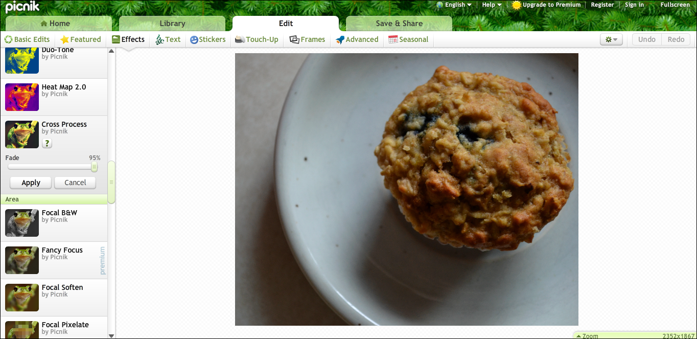
Sample Editing on Picnik
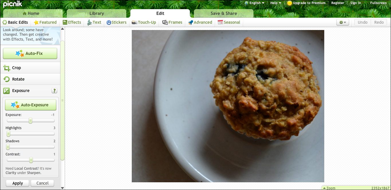
To demonstrate my point and help you find your way around Picnik, here is a step-by-step example of the way I edit most of my photos. I don't have the upgrade, so I only have free features to work with, but you can do so much with these if you use them lightly and correctly.
Step 1: Crop
I needed to crop a little extra space off of my photo, so that the muffin is more in-focus, and your eye isn't distracted by excess white space. Be careful not to crop too much (if you want an up-close photo, take it up-close), as too much cropping will greatly decrease your photo's quality.

Step 2: Cross Process
This is a pretty cool coloring feature that adds a yellow-blue vintage tint to your photos. I use 5% of it on this photo; make sure not to use too much of this coloring, or your photo will end up looking very..picnik-y. I've seen it too often.
Step 3: Exposure and Contrast
This is an important part of the editing process that will help enhance the parts of your photo that had some bad lighting, but again, DO NOT OVERUSE. I usually (as with this photo) decrease the exposure to -1, increase the highlights to 3, increase the shadows to 2, and increase the contrast by a mere 1. It depends on what the photo need, of course--but a little contrast goes a looooong way.
Step 4: 1960's hue
I love this reddish/vintage color effect for food shots, especially. So, I added 57% to this photo. It adds a little haze, too, so if you want a super-clear photo, use in moderation.

Step 5: HDR-ish
I used to overuse this effect like crazy. Believe me: big mistake. Especially on portraits. Basically, it brings out all of the texture in a photo, and looks almost like a drawing if used too heavily. If your subject happens to have some blemishes or acne, this will look...horrendous. Plus, this is a photo. Not a drawing.
So, I used an eensy-teensy-weensy bit only on this photo, just to make it pop a little more since I didn't focus quite correctly. 3%, to be precise. Be careful with this feature.

Adding Text
Sometimes you will want to add text to your photo. Picnik has a great variety of fonts which can be inserted with the click of a button, but there are right and wrongs even with this simple task. For starters, don't use "too Picnik-y" of a font, such as the one below. Secondly, make sure to use a matching color or just a simple white/black. Fade the font a little to make the picture stand out even with the text.
Wrong font:

Right font:

..and now I am finished! Let's compare photos.
Before:

After:

...not that much of an edit, but still, there is a visible enhanced difference between the first photo and the second! The key is to use small amounts of each effect you want to use. If I had added too much contrast or cross process effect, this photo would have been ruined!
A list of 'dont's' for Picnik
If you are aiming for an amateur-ish photo, completely ignore these "rules." But if you want to get the most out of Picnik, vow to steer clear of the following effects, no matter how cool they seem. Because believe me, 99.999 out of 100 they will look completely wrong.
Don't ever use:
Focal soften
Orton-ish
Cinema Scope
Focal zoom
Too much teeth-whitening
Vignette
Matte
Dorky and fake-looking frames
Lomo-ish
Holga-ish
..etc.
..and most especially, don't ever use too much of anything.
---
To close, here are some photos which I have edited, mainly using Picnik. I have come a long ways in photo editing, and can unabashedly confess that once I was a girl who succumbed to the draws of over-editing. So, take it from me that there is always room for change.


See? You don't need to empty your pockets or frizzle your brain cells to get some good photo enhancement. Though, if you want to to give me photo shop as a little "we appreciate you" present, I definitely won't complain. ;)
Happy editing!
-lucia


